Search Widget Advanced Configuration
You may edit your Search Widget code for deep customization. Please feel free to contact us with questions or advice on making your customization changes.
Widget configuration attributes
- tokeet-widget - widget type (the only valid value is "availability-search") html data-tokeet-widget="availability-search"
- website-domain - website url (user will be navigated to that page after clicking SEARCH button)html data-website-domain="mrentals.housesquatting.net"
- date-format - optional date format. default is "DD-MM-YYYY" (see moment.js string formats.html data-date-format="YYYY-MM-DD"
Style customization attributes
- orientation - optional orientation. could be "vertical" (default) or "horizontal" html data-orientation="vertical"
- style-widget-background - widget background color in css format html data-style-widget-background="#ccc"
- style-button-bg - SEARCH button background color in css format html data-style-button-color="darkgreen"
- style-button-color - SEARCH button text color in css format html data-style-button-color="white"
- style-label-color - field label color in css format html data-style-label-color="rgba(255, 255, 255, .7)"
- style-label-size - field label font size in css format html data-style-label-size="13px"
- style-selected-dates-bg - selected dates range background color in css format html data-style-selected-dates-bg="darkred"
- style-selected-dates-color - selected dates range text color in css format html data-style-selected-dates-color="white"
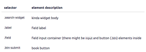
Beyond editing existing code, you can add CSS code into search widget code for infinite customization possibilities.
- availability-widget-css - CSS code to be injected into search widget iframe
Example: data-availability-widget-css=".search-widget{ background: red }"

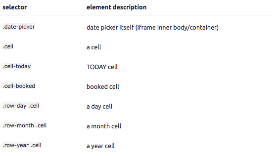
- date-picker-css - CSS code to be injected into date picker iframe
Example: data-date-picker-css=".cell{ background: red }"

As always, please contact us with questions any time. We're happy to help.