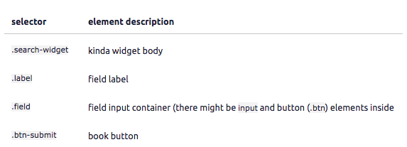
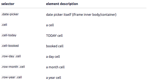
You may edit your Search Widget code for deep customization. Please feel free to contact us with questions or advice on making your customization changes.
Widget configuration attributes
tokeet-widget - widget type (the only valid value is "availability-search") html data-tokeet-widget="availability-search"
website-domain - website url (user will be navigated to that page after clicking SEARCH button)html data-website-domain="mrentals.housesquatting.net"
date-format - optional date format. default is "DD-MM-YYYY" (see moment.js string formats.html data-date-format="YYYY-MM-DD"
Style customization attributes
orientation - optional orientation. could be "vertical" (default) or "horizontal" html data-orientation="vertical"
style-widget-background - widget background color in css format html data-style-widget-background="#ccc"
style-button-bg - SEARCH button background color in css format html data-style-button-color="darkgreen"
style-button-color - SEARCH button text color in css format html data-style-button-color="white"
style-label-color - field label color in css format html data-style-label-color="rgba(255, 255, 255, .7)"
style-label-size - field label font size in css format html data-style-label-size="13px"
style-selected-dates-bg - selected dates range background color in css format html data-style-selected-dates-bg="darkred"
style-selected-dates-color - selected dates range text color in css format html data-style-selected-dates-color="white"
Beyond editing existing code, you can add CSS code into search widget code for infinite customization possibilities.
availability-widget-css - CSS code to be injected into search widget iframe
Example: data-availability-widget-css=".search-widget{ background: red }"

date-picker-css - CSS code to be injected into date picker iframe
Example: data-date-picker-css=".cell{ background: red }"
